
Introduction
The term “balayage” originates from the French word meaning “to sweep,” describing a hair coloring technique where color is hand-painted onto the hair for a natural, sun-kissed look. This method gained popularity for its effortless blend and soft transitions, allowing for a personalized and dynamic appearance. Just as balayage revolutionized hair coloring, it can also transform your home decor, infusing spaces with a sense of depth, warmth, and modernity. The gentle gradients and fluid transitions of color can breathe life into your surroundings, creating atmospheres that reflect your unique style and personality. This article aims to guide you through the exciting world of balayage-style color gradients in home decor, providing you with the inspiration and practical tips needed to create your own stunning transformations.
“Creating a cozy reading nook is all about maximizing comfort in a small space. It’s about intentional design that serves both function and feeling.”
– Interior Design Magazine
Understanding Balayage: The Basics
Balayage is characterized by its freehand application technique, which results in soft, natural-looking highlights that blend seamlessly into the base color. Unlike traditional highlighting methods that use foils, balayage allows for greater creativity and customization. The technique can be tailored to suit various hair types and colors, making it universally appealing. When we apply the concept of balayage to home decor, we embrace the idea of using color gradients to create a similar soft transition between hues, enhancing the visual appeal of a space.
Color psychology plays a crucial role in how we perceive our environment. Different colors can evoke specific emotions and influence our mood. For example, blues and greens are often associated with calmness and tranquility, while yellows and oranges can energize a space. Understanding the psychological impact of colors can help you choose gradients that not only look beautiful but also create the desired atmosphere in your home. Furthermore, color theory, which examines the relationships between colors, can offer insights into creating harmonious color palettes for your decor.
Choosing Your Color Palette
Selecting a cohesive color palette is vital for achieving a balanced and inviting space. Start by identifying colors that resonate with your personal style. Consider the mood you want to evoke in each room; for example, calming shades for a bedroom or vibrant hues for a home office. It’s essential to pay attention to undertones—cool colors often have blue or green undertones, while warm colors may lean towards reds or yellows. Complementary colors, or those that sit opposite each other on the color wheel, can also create striking contrasts when used in gradients.
Utilizing tools and resources can simplify the color selection process. Color wheels can help you visualize relationships between colors, while online tools such as Adobe Color allow you to experiment with different palettes. Many paint brands also offer virtual room visualizers that let you see how colors will look in your space. By taking advantage of these resources, you can confidently choose a palette that reflects your style and enhances your home.
Applying Balayage Techniques in Different Rooms
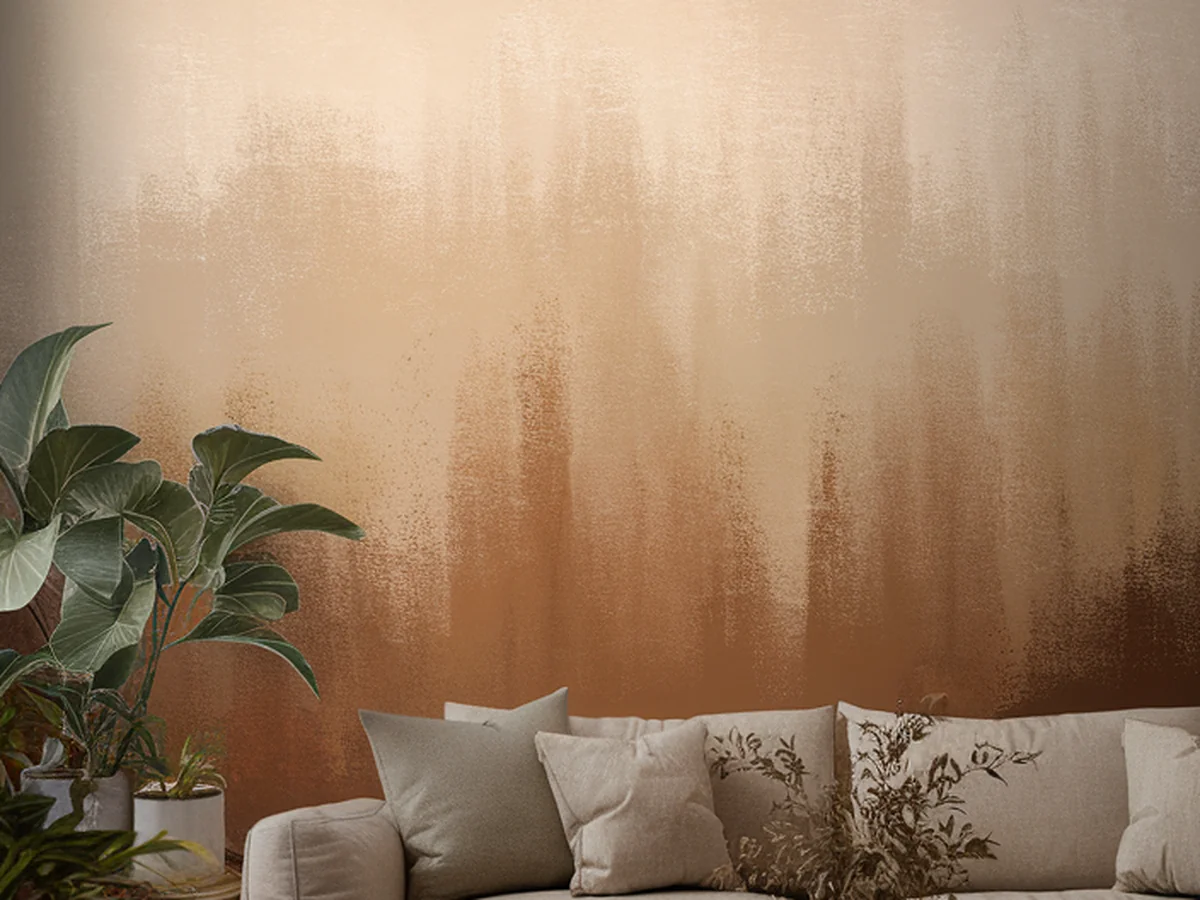
Living Room
In the living room, consider creating a gradient wall that transitions from a soft neutral at the base to a darker, richer shade at the top. This effect can add height to the room while creating a cozy ambiance. You can also incorporate gradient furniture accents, such as a dip-dyed coffee table or ombre cushions, to tie the look together without overwhelming the space.
Bedroom
For the bedroom, soft gradients can promote relaxation and peace. Consider painting your walls in a subtle ombre effect, transitioning from a pale blue at the bottom to a gentle lavender at the top. This calming palette can create a serene retreat atmosphere, perfect for unwinding after a long day. Incorporating gradient textiles, such as bed linens or curtains, can further enhance the soothing vibe.
Kitchen
The kitchen is a great place to introduce playful color transitions. Think about applying a bold gradient to your cabinetry, where the bottom cabinets are a vibrant color that gradually lightens towards the top. You can also experiment with a gradient backsplash, using tiles that transition from bright white to deep teal, adding visual interest and a modern touch.
Bathroom
In the bathroom, gradients can evoke a spa-like feel. Using soft blues and greens can mimic the tranquility of water, creating a refreshing environment. Consider using gradient tiles or a painted wall that transitions from a soft aqua to a serene white, enhancing the space’s overall aesthetic while promoting relaxation.
Home Office
Incorporate energizing color combinations in your home office to boost productivity. A gradient wall that shifts from a warm yellow to a vibrant orange can stimulate creativity and focus. You can also use gradient desk accessories, like a pencil holder or a mouse pad, to subtly reinforce the color scheme and create an inspiring work environment.
Incorporating Textures and Patterns
Texture plays a significant role in how we perceive color gradients. Different materials can affect how light interacts with colors, enhancing or softening their appearance. For instance, a matte finish can create a more subdued look, while glossy surfaces can make colors pop. To maximize the impact of your balayage decor, consider using patterned wallpaper or textiles that feature gradient designs. This can add depth and visual interest to your space.
Mixing different materials—such as wood, fabric, and metal—can further enhance the balayage effect. For example, pairing a gradient wall with wooden furniture can create a warm and inviting atmosphere. Textured fabrics, like woven throws or velvet cushions, can also contribute to the overall aesthetic while adding a tactile dimension to your decor.
DIY Balayage Techniques for Home Decor
Transforming your space with balayage-style gradients doesn’t have to be a daunting task. Here are some step-by-step instructions for DIY color gradient wall painting:
1. Choose Your Colors: Select two or more colors that you want to blend. Ensure they have similar undertones for a smooth transition.
2. Prepare the Wall: Start by cleaning the wall and applying a base coat of the lighter color. Allow it to dry completely.
3. Create the Gradient: Using a large brush or a sponge, apply the darker color to the top of the wall. As you move down, gradually mix in the lighter color with the darker one to create a seamless transition.
4. Blend the Colors: Use a clean brush to blend the two colors where they meet, feathering the edges to soften the transition.
5. Finish Up: Allow the paint to dry, then assess if any touch-ups are needed. Once satisfied, seal it with a protective finish if desired.
In addition to wall painting, you can also explore DIY projects like ombre furniture or accessories. For example, you can paint a wooden chair with a gradient effect or create a gradient vase using spray paint. Always remember to prioritize safety by using proper ventilation and protective gear during your projects.
Professional Help: When to Call in the Experts
While DIY projects can be fun and fulfilling, there are scenarios where hiring a professional interior designer can make a significant difference. If you’re considering a major overhaul or feel overwhelmed by choices, a designer can provide valuable insights and expertise. They can help you refine your vision, select the right colors, and ensure that the final look aligns with your goals.
When approaching a designer, it’s essential to communicate your vision clearly. Share your inspirations, preferences, and any specific ideas you have for incorporating balayage-style gradients. Prepare a list of questions to assess their experience with color gradients and their approach to creating cohesive spaces. Here are some important questions to consider:
| Question | Purpose | Example |
|---|---|---|
| What is your experience with color gradients in decor? | To gauge their expertise. | Identify past projects that showcase their skills. |
| How do you approach color selection for a space? | To understand their design philosophy. | Learn about their process for creating cohesive palettes. |
Maintaining Your Balayage-Style Decor
Once you’ve successfully transformed your space with balayage-style color gradients, it’s essential to keep those colors vibrant and fresh over time. Regular maintenance can help preserve the beauty of your decor. Here are some tips for upkeep:
– Cleaning: Use gentle cleaning solutions that won’t harm the paint or materials. Avoid abrasive tools that can scratch surfaces, particularly on textured or glossy finishes.
– Lighting Considerations: Keep in mind that lighting plays a significant role in how colors are perceived. Natural light can enhance color vibrancy, while artificial lighting can sometimes dull hues. Consider installing adjustable lighting options to create different moods throughout the day.
– Periodic Updates: Over time, tastes may change, and certain colors may feel dated. Consider refreshing your gradients by adding new accessories or painting an accent wall in a complementary color. This can keep your space feeling new and exciting.
Inspiration: Real-Life Examples and Case Studies
Real-life examples can provide excellent inspiration as you embark on your balayage home decor journey. Many homeowners have embraced this style, showcasing stunning transformations that highlight the beauty of color gradients.
For instance, a recent case study featured a living room that transitioned from a soft cream at the bottom to a rich navy blue at the top. The result was a striking yet cozy space that exuded sophistication. Before-and-after images of this transformation reveal the dramatic impact that color gradients can have on a room.
Homeowners who have ventured into balayage-style decor often share their experiences, emphasizing the uplift in mood and ambiance. One homeowner noted, “The gradient wall in my living room has become a conversation starter—everyone loves how it draws the eye and makes the space feel larger.”
Conclusion
Balayage-style color gradients can truly transform your home decor, infusing your spaces with personality and warmth. By understanding the principles of color selection, applying creative techniques, and maintaining your decor, you can create an environment that reflects your unique aesthetic and enhances your daily life. Embrace the opportunity to experiment with color and let your creativity shine through. Share your own balayage-inspired decor transformations on social media and inspire others to explore the beauty of gradient colors in their homes.
Frequently Asked Questions
What is balayage in home decor?
Balayage in home decor refers to the technique of applying color gradients to walls, furniture, and accessories, mimicking the natural and soft transitions seen in hair balayage. This approach brings depth and visual interest to a space, creating a modern and stylish atmosphere.
How do I choose the right colors for my balayage decor?
Choosing the right colors involves understanding your personal style and the mood you want to create. Consider using a color wheel to find complementary colors and ensure the undertones match. Experiment with samples on your walls to see how they look in different lighting.
Can I achieve balayage effects without professional help?
Absolutely! Many DIY enthusiasts successfully create balayage effects through painting techniques, ombre furniture, and fabric gradients. With the right tools, preparation, and creativity, you can achieve stunning results on your own.
How do I maintain my balayage-style decor over time?
To maintain your balayage decor, regularly clean surfaces with gentle products, consider the impact of lighting, and refresh colors or accessories periodically to keep the space feeling vibrant and updated.
Where can I find inspiration for balayage decor?
Inspiration can be found in various sources, including home decor magazines, social media platforms like Pinterest and Instagram, and design blogs. Visiting local home improvement stores can also help you visualize color combinations and textures.